Contents
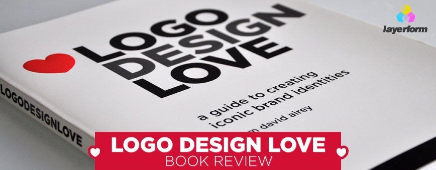
Logo Design Love (Check it out here on Amazon) is the popular book by Irish Graphic Designer David Airey, and has received much credit from the design community, becoming a regular on the shelves of thousands of designer’s across the globe.

The importance of brand identity
lets get started with the first part of this Logo Design Love Review. The first three chapters in the book are concerned with outlining a brief history of brand design with fascinating examples of modern day brands and their perceived values contributing to a wider-known worldwide brand.
Example: Imagine a celebrity who drives an Aston Martin instead of a Skoda which is consistently ranked highly in awards due to reliability, mileage etc. The Skoda would be the logical choice but its Aston Martin’s identity which conjures up images of luxury and class that clinches the deal and typically sways the decision of a buyer. This is the power of branding.
Chapter 2 ends with David Airey once again picking up on the fact we should rethink the importance of brand identity: “The perceived value of a service or product is usually greater than the actual one” (this is very true). The same brand mark seen time and time again helps build trust and thus helps keep customers coming back for more, logos fundamentally help people remember their experiences with companies.
The essence of Chapter 3 outlines the Elements of Iconic Design, David states that “Anyone can design a logo, but not everyone can design the right logo“, the elements of iconic design are as follows:
- Keep it simple
- Make it relevant
- Incorporate Tradition
- Aim for Distinction
- Commit to memory – David mentions “A solid iconic design is one that onlookers will remember after just one quick glance”
- Think small – A logo needs to scale to all sizes, from a billboard to a clothing label, scaling is very important.
- Focus on one thing – Design that one powerful feature that will make your mark stand out.
The Process of Design
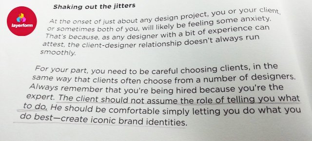
The next 5 chapters are purely concerned with the process of design regarding dealing with clients and setting up a good design brief, something that a lot of designers are simply poor at. David begins the section by outlining that the client-designer relationship doesn’t always run as smooth as it should. He progresses to mention something that ALL designers should remember:

Gathering vital information from a brief such as the name, years in business, background history etc all contribute towards a more accurate design brief and fundamentally a better piece of work will be produced first time round to a prospective client.
Skirting the Hazards of a Redesign

This chapter really emphasizes the potential pitfalls of a redesign, giving the rebrand of “Tropicana” particular emphasis. In 2009 PepsiCo lost £33Million when they attempted a rebrand, losing the iconic “straw in orange” graphic and logotype. David also talks about the Coke rebrand in 1985 where they changed the look AND flavour of the product, and this was due to a select group of people who pressed the company into changing its look and feel, even when there was nothing wrong with the original formula and branding.
David brings up an important point, that you must be diplomatic when accepting the reasons for a redesign. Sometimes clients may just look at their brand and simply feel its not right “on the day”, or similarly to Coke, be pressured by others to change it and give it more “pizzaz”. This chapter really emphasized how important it is to be diplomatic with clients, sit down with them and fully understand their reasoning for a rebrand, why they think it is necessary, what they want to achieve, and how you as the professional designer can help them to achieve their goal
Pricing Design, Sketching, and Presenting Work
Now onto the pricing design & presenting work half of this logo design love review. As a brief overview of Chapters 6-8, David goes into much detail about how to price your design, which includes factors such as your level of expertise, turnaround time, level of demand and of course the current economy. These are all things that need to be taken into consideration as a designer, we have costs and bills to pay so always take a 50% downpayment on a brief and encourage the company to avoid spec work, the bane of every designer’s life.
Sketching & Conceptualisation
In Chapter 7 David outlines how to properly brainstorm ideas for branding design. These include putting pen to paper and doing an old fashioned mindmap. The pencil is your friend, and with a sketchpad you can come up with your ideas before jumping into Photoshop and prematurely shooting your branding juice (yeah i really just said that).
Chapter 8 focuses on client presentation and David outlines 4 important rules when dealing with clients:
- Rule #1: Conspire to Help
- Rule #2: Avoid intermediation
- Rule #3: Take Control
- Rule #4: Keep the committee involved
The Finale of this Logo Design Love Review (Juicy Pointers included)
Chapter 9 and 11 illustrate some great pointers regarding Logo Design, with Chapter 10 being a “questions answered” section which we wont strictly review (although its worth a read). Here are David’s key points regarding Staying Motivated in the field of Brand/Identity Design:
- Never stop learning You can always learn more about your craft as a designer
- “Be Four Years Ahead” – Key quote by David Hyde of Studio Hyde
- Create for You
- Step away from the computer Whilst the modern era has provided us with a plethora of tools to use, photoshop, fontlab, illustrator etc, the best ideas will always come from pen and paper, design has been around a lot longer than technology
- Balance Your Life
- Journey back in time – Take time to evaluate your previous work
- Show relentless desire
- Dont Overwork yourself
- We all get stuck, no matter who we are– Keep trying and practicing your craft
- Dont skip steps in the design process
- Show relentless desire & find common ground with clients
- Stick to deadlines and think laterally
- Improve how you communicate and Manage your expectations
- Always design & follow your bliss– Pursue your passion and keep developing as a designer
25 Practical Logo Design Tips, Full List (Click here)
- 1. Always ask questions
- 2. Understand Print Costs
- 3. Expect The Unexpected
- 4. A logo doesn’t need to say what a company does
- 5. Not every logo needs a mark
- 6. Give your logo one thing thats memorable
- 7. Don’t neglect the sketchpad
- 8. Leave trends to the fashion industry
- 9. Step away from Photoshop
- 10. Work in black and white
- 11. Keep it relevant
- 12. Remember legibility
- 13. Be consistent
- 14. Match the type to the mark
- 15. Offer a single color version
- 16. Pay attention to contrast
- 17. Aid recognition
- 18. Test a variety of sizes
- 19. Reverse it – Offer logos on different backgrounds
- 20. Make sure your logo looks good from all angles
- 21. Consider trademarking your design
- 22. Don’t neglect the substrate
- 23. Don’t be afraid of mistakes
- 24. A logo is not a brand
- 25. It’s a two way process, Client & Designer
Finito!
Well there we have it, a fairly hefty Logo Design Love Review. I would give this book a solid 9/10 for its sheer awesomeness. I read it and instantly opened my sketch pad and began branding experiments right there and then. How many books can inspire you like that? Really. Well done on such a fantastic book David, it really is a credit to you and all Branding experts (and noobs) alike.
Do me one last favour?
Buy the dam book! It can be bought and fully appreciated here: Logo Design Love Book on Amazon


Leave a Reply
You must be logged in to post a comment.